Some fun with D3.js
I’ve been intrigued by D3.js and the impressive visualizations I’ve seen people make for quite some time and I finally got to check it out for myself. I wanted to write this blog post sharing my experiences and revelations from the perspective of someone who at one point spent a fair amount of time with Matlab/Octave and my personal fave matplotlib.
The first major point I want to make is that D3.js is not a plotting library - it should not be compared directly to Matlab/Octave or matplotlib because they serve different purposes. D3.js is a visualization library, sure this visualization may be a graph but you shouldn’t be playing with D3.js until you already understand your data and simply want to show it off. While exploring and figuring out your data matplotlib is going to be way faster and more effective (note there are some wrappers building standard plotting functions ontop of D3.js like NVD3 if javascript is really your thing).
Once you’ve figured out your data and it’s time to show-off D3.js really shines and here is the main reason why in my opinion. It’s due to a fundamental shift in a way of thinking that makes D3.js so powerful: rather than calling plot with an array of x and y values I am binding an array of javascript objects to my plot and then telling it which attributes to use for different things. Essentially you are pulling more data into the plot and you can write code at each level - let me show you the snippet that made me realize how powerful this shift in thinking is:
var chart = d3.select(".chart");

var tip = d3.tip()
.attr('class', 'd3-tip')
.offset([-10, 0])
.html(function(d) { return "<span>" + d.text + "</span>"; });

chart.call(tip);

var bar = chart.selectAll("g")
.data(data)
.enter().append("g")
.attr("transform", function(d, i) { return "translate(" + i * barWidth + ",0)"; });

bar.append("rect")
.attr("y", function(d) { return y(d.value); })
.attr("height", function(d) { return height - y(d.value); })
.attr("width", barWidth - 1)
.on('mouseover', tip.show)
.on('mouseout', tip.hide);
The important parts to note are this: I grab the value for my y axis of the rect from d.value where d is one of the objects in my data array that I am plotting. So far this is pretty standard but look at the tip function that gets called on mouseover - it shows a span which contains d.text! I’ve attached another piece of data here called text that can be used to display more information! This was the wow moment for me because this kind of thing isn’t possible in matplotlib and showing a simple tooltip is really only the beginning of what you can do with all this added context.
Also something about plots with a :hover effect is kind of awesome!
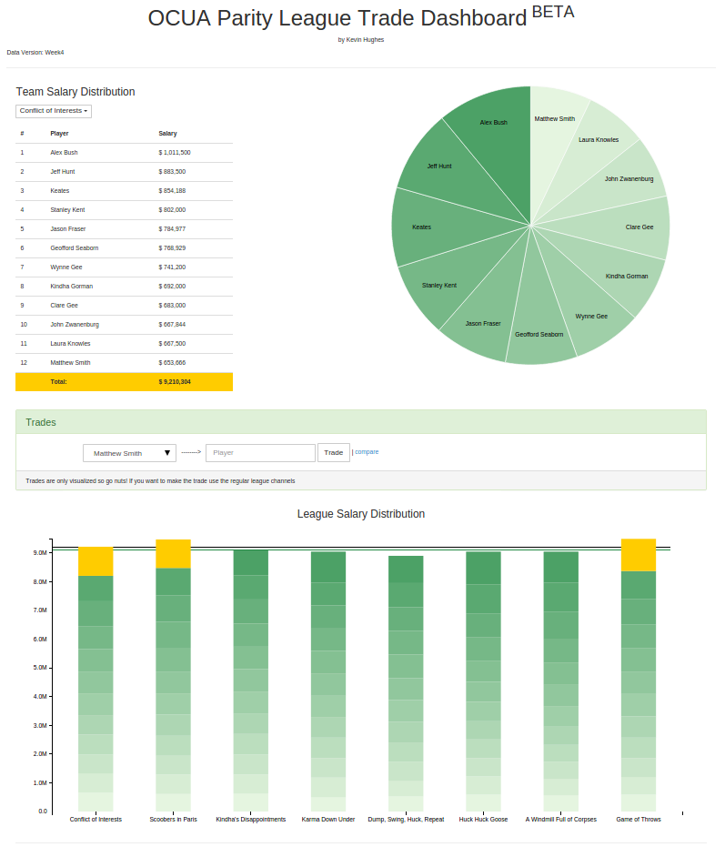
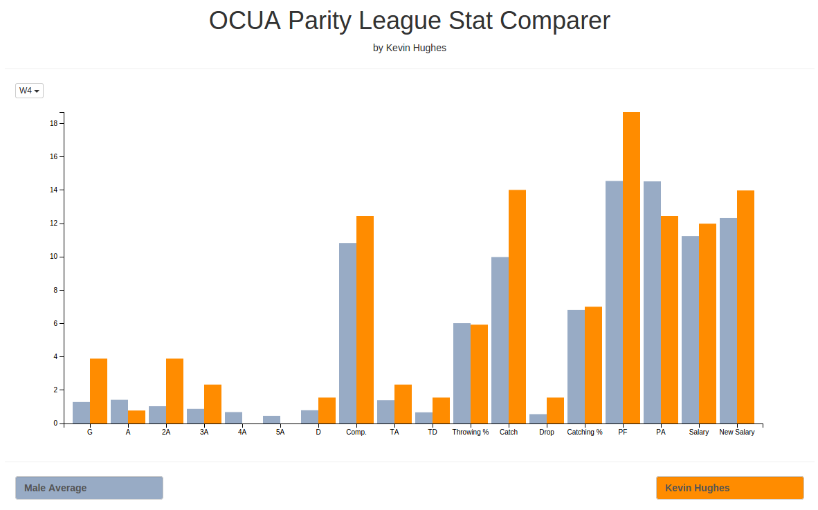
If you haven’t played with D3 yet and have some cool data I definetly recommend it, I used it to make some pretty sweet visualizations/tools for our Parity Ultimate Frisbee League here in Ottawa, check’em out: